

How to visualize Survey Data in Tableau
Your task as a data analyst is to provide actionable insights for your team. Not only get it, but present results to decision makers. And Tableau is a great help here. Several common rules and pittfalls are valid for any field. Let's go through them.
Steps of survey data analysis we cover below:
-

Where do we start?
-

A bit of knowledge about data and question types in surveys. All this is important for further work with survey data.
-
 Information about survey tools and data processing tools. Our Tableau Prep using cases.
 -
 Checklist of what needs to be done with your data to make a story.
 -
 Here are the most popular and suitable types of survey data visualizations. Help in building.
 -
 What is essential for building a good dashboard (+examples) and other ways to share survey data.
What to consider in survey analysis?
Tableau has rich functionality that will help us bring table data into a form suitable for visualization. We will talk about the possibilities of Tableau and what pitfalls there may be.
With a bit of work to get the data set up correctly and with the right tools to interrogate and visualize your data, you'll get a better, more profound understanding of your decision-makers.

Survey data
and question types
Quantitative research or qualitative research?
Surveys are an excellent tool for quantitative research as they are cost-effective, flexible, and allow researchers to collect data from a considerable sample size.
Quantitative data will give you measurements to confirm each problem or opportunity and understand it.
Qualitative data collects information that seeks to describe a topic more than measure it. This type of research measures opinions, views, and attributes vs. complex numbers that would be presented in a graph or a chart.
Qualitative research methods usually involve first-hand observation, such as interviews or focus groups. It is market research usually conducted in natural settings, meaning that researchers study things as they are without manipulation – there are no experiments and control groups.
Qualitative researchers seek to delve deep into the topic at hand to gain information about people's motivations, thinking, and attitudes. While qualitative approaches bring a depth of understanding to your research questions, they can make the results harder to analyze.
So how do you put these two forms of research together?
Qualitative research is almost always the starting point when you seek to discover new problems and opportunities – which will help you do more profound research later. Quantitative data will give you measurements to confirm each problem or opportunity and understand it.
Open-ended and close-ended questions
Question types define features of survey data and dashboard functionality.
- Quantitative questions gather numerical data, which can be analyzed using a data analysis platform. It’s a close-ended question generates a limited set of responses.
- Plus: easy to analyze. High popular Likert scale question or Net Promoter Score is a close-ended question with multiple response questions.
- Minus: high probability of thoughtlessness of answers, possible random choice, the automatism of the respondent.
- Qualitative questions are often open-ended and help answer "why” and gain context about quantifiable data and understand hard-to-quantify behaviors. Open-ended questions require free-form answers. They are justified at the stage of trials, pilotage, determination of the study area.
- Plus: it allows you to probe deep into the respondent's answers, gaining valuable information about the subject.
- Minus: respondents need more time to respond. But the main problem for you is further work with the analysis of open-ended questions.
Tableau data cleaning
and preparing
Survey data software and tools
Here it's the popular tools and technologies available to help you get your data set up for visualizing survey data:
- Tableau's Built-In Pivot Feature
- Tableau Prep
- Tableau's Add-In for Microsoft Excel
- Alteryx Designer, and so on.

Tableau Prep, Alteryx, Tableau Desktop joins
What does their setup look like?
Tableau's pivot feature
First, we need to pivot/reshape the data so all questions merge into two columns.
Then we make label responses, numeric responses, logical groupings, and mapping of question IDs, all in a human-readable form.

The columns become grouped
Cartesian product problem
there is a problem with processing questions with multiple responses. It's because of using Cartesian join. What's the problem?
- If we use close-ended questions with single answers (gender, age, place of residence), processing in Tableau is not tricky.
- But if we work with close-ended and multiple response questions, we bring such answers to a flat table. Cartesian join (product) works for this. A Cartesian join can be helpful when dealing with sparse data or data blends or unpivoting to create a very tall data source to get the desired layout.
- But in the case of Cartesian join for multiple responses, unwanted data multiplication occurs.
- Handling multiple answers has become more accessible since the Tableau update 2020.4. Using relationships functionality, handling multiple responses has become much more manageable.

Our Tableau Prep experience: data model and relationships
2000 respondents project
100 000 respondents survey project
So, single responses became a separate dataset (called Extract 1). From each multiple answers, we also made data sources (Extracts). Further, using logical links, we connected our various responses to single ones – by respondent ID.
Data collection survey tools
Survey data storytelling
The data can reveal much with advanced goals and the right questions in your survey. And Tableau has built-in capabilities to look at data in all ways. Users could be excited about looking at research data. Isn't it great?
So, what questions should we start storytelling with?
Questions such as Gender, Location, Generation, Weight, etc., allow you to understand your target audience better. You'll find out the opinion of the particular audience segment you are interested in.
Checklist for your survey data to make a story
- FiltersFilters are the most straightforward tools for finding trends under the surface of your survey data. Filters allow you to see how a particular group of respondents answered the questions in your survey based on how they responded to other questions in your survey.
- Custom crosstab reportCrosstabs reports are tables that show how different groups of respondents in your survey (the columns of the table) answer various questions in your survey (the rows of the table). Like filters, they help look under the surface of your top-line results and see how different people answer questions in your survey differently.
- MetadataIn survey research, metadata is vital. It describes statistical data from survey conceptualization to data dissemination. Metadata can be comprehensive and encompasses populations, methods, survey instruments, analysis approaches, results of instruments, and so on.
- TooltipsTooltips give survey users more information about a specific word or phrase in your survey. For example, you can use a tooltip to define a word in your survey people may not be familiar with or give extra context about how to answer a survey question.
- a parameter control;
- color highlighting;
- visual ranking within the category.

Visualizing survey data
Here are the most popular and suitable types of survey data visualizations. Help in building.
Tableau survey data dashboard
Now it's time to share your story and put visualizations on a dashboard. This format is a very efficient and effective way to communicate survey data – to share insights at the presentations at the meetings.
How to customize your Tableau dashboard based on user requirements?


Select which worksheets and objects do you want on the dashboard and where to place them. This is where a sketch on paper comes in handy.


Your dashboards dynamically stay up-to-date and can be shared with anyone via a weblink.
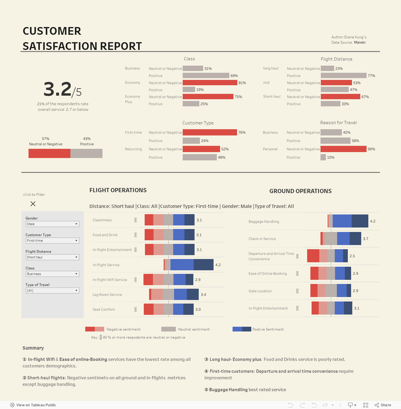
Customer satisfaction comparison dashboard example
Using survey results
Who is the dashboard user, and what is his technical level? Maybe he is not deeply immersed in analysis but are just business users? Maybe he needs not a dashboard,
but a simplified format?

Allow them:
-to dig into their data using filters in packaged workbooks and the free Tableau Reader application;
-to export chart images for presentations or download crosstabs for their needs.

Send them:
-a PDF of the workbook;
-specific images of particular slides for their presentations.
Analyse survey data with us
By clicking the button, you agree to the processing of personal data. We use it to stay connected. Read more