

Vizuators' blog
Primary air pollutants
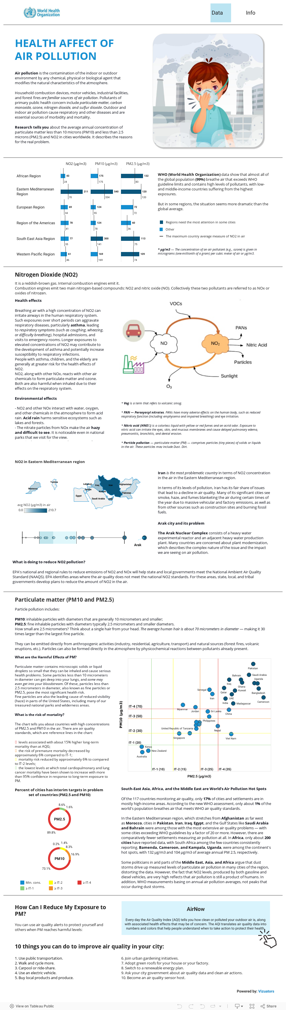
Which countries have the dirtiest air, and how much does it affect the death rate?
What primary air pollutants are we forced to inhale with urban smog? Having asked these eco-questions, we made an infographic in Tableau.
What primary air pollutants are we forced to inhale with urban smog? Having asked these eco-questions, we made an infographic in Tableau.
The infographics were created using WHO global reports, local resources and networks, and measurements collected by the Global Burden of Disease project.
Us air pollution data
One of the sources we used is AirNow, source for air quality data.
AirNow reports air quality using the official US Air Quality Index (AQI), a color-coded index designed to communicate whether air quality is healthy or unhealthy for you. When you know the AQI in your area, you can take steps to protect your health.
AirNow is a partnership of the US Environmental Protection Agency, National Oceanic and Atmospheric Administration (NOAA), National Park Service, NASA, Centers for Disease Control, and tribal, state, and local air quality agencies.
AirNow is a partnership of the US Environmental Protection Agency, National Oceanic and Atmospheric Administration (NOAA), National Park Service, NASA, Centers for Disease Control, and tribal, state, and local air quality agencies.

Air pollution infographic
Are you ready to dive deep into the health effect of the air pollution problem?
We present a Tableau research tells you about the average annual concentration of particulate matter and NO2 in cities worldwide.
We present a Tableau research tells you about the average annual concentration of particulate matter and NO2 in cities worldwide.
It's time to explore
your data
If you are interested in similar studies on other topics or have collected data that it is time to convey to others clearly and effectively, please contact us.
Let's make an appointment and discuss the details of the project.
Let's make an appointment and discuss the details of the project.
By clicking the button, you agree to the processing of personal data. We use it to stay connected. Read more

Contact us