


Metrics Difference as Gantt Chart
Case 18.
When you work by comparing several metrics with each other (for example, profit for the current and previous years), you can display the difference not only with the usual bar from the beginning of the axis but also with a bar that visually connects the tops of the actual measures. And by adding color coding, you can speed up the process of data perception.
How can comparing several metrics help
- Comparing several metrics can help identify trends and correlations that would be difficult to spot if only looking at a single metric; it identify areas that need improvement or further investigation, as well as potential opportunities for growth.
- Comparing metrics can also help identify potential problems and provide insights into how different aspects of a business are performing.
- Gantt charts are a great way to visualize and track the progress of a project. They can help project managers quickly identify tasks, milestones, deadlines, and any potential risks or issues associated with the project. With Gantt charts, project managers can easily monitor project progress and identify areas for improvement.
How to implement metrics difference as Gantt chart
How to implement metrics difference as Gantt chart
Check our Tableau Public workbook for step-by-step instructions.
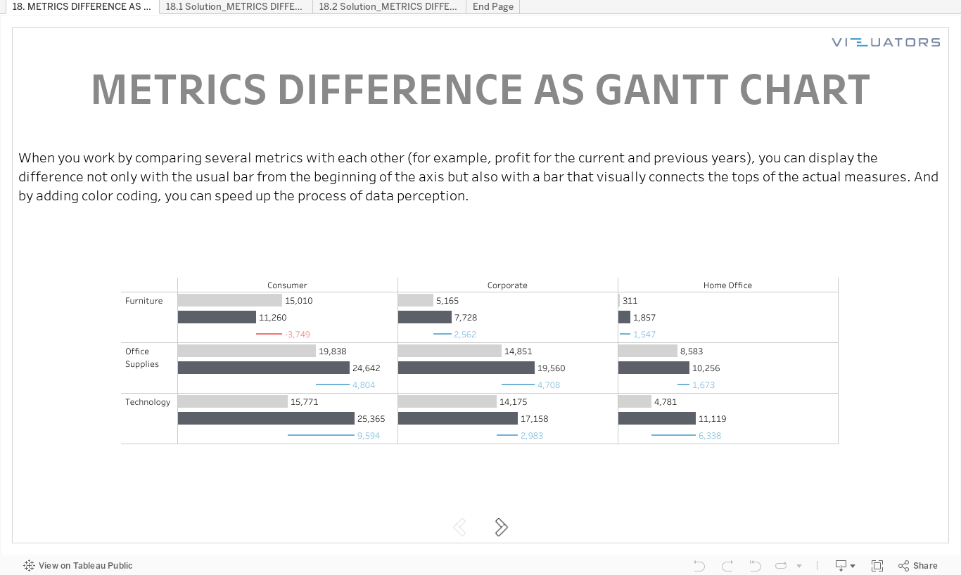
Tableau practice is the best way to develop your data visualization skills. Therefore, our team trains Tableau skills by solving additional tasks of varying complexity. Then we meet via Zoom and discuss all possible solutions.
We call it Tableau Challenges and invite you to participate!
We call it Tableau Challenges and invite you to participate!
Take your free
Tableau workbook
Leave your mail, and we will send you a workbook with the tasks and a link
to the solution registration page.
Enjoy experts' solution analysis with Vizuators team!
to the solution registration page.
Enjoy experts' solution analysis with Vizuators team!
By clicking the button, you agree to the processing of personal data. We use it to stay connected. Read more

Contact us