


Scatter Plot
Alternative
Case 9.
This kind of chart can work as an alternative to the scatter plot. In this case, the bar height shows the sum of sales, and the bar width indicates the number of products.
How does scatter plot alternative help?
- This chart can be used to compare different categories, such as comparing sales across other regions.
-
Additionally, it can be used to compare sales for different products within a specific category.
- The chart is also helpful in determining sales trends over time. Plotting bars on a timeline makes it easy to identify emerging trends in sales.
How to implement alternative
scatter plot
How to implement alternative
scatter plot
Check our Tableau Public workbook for step-by-step instructions.
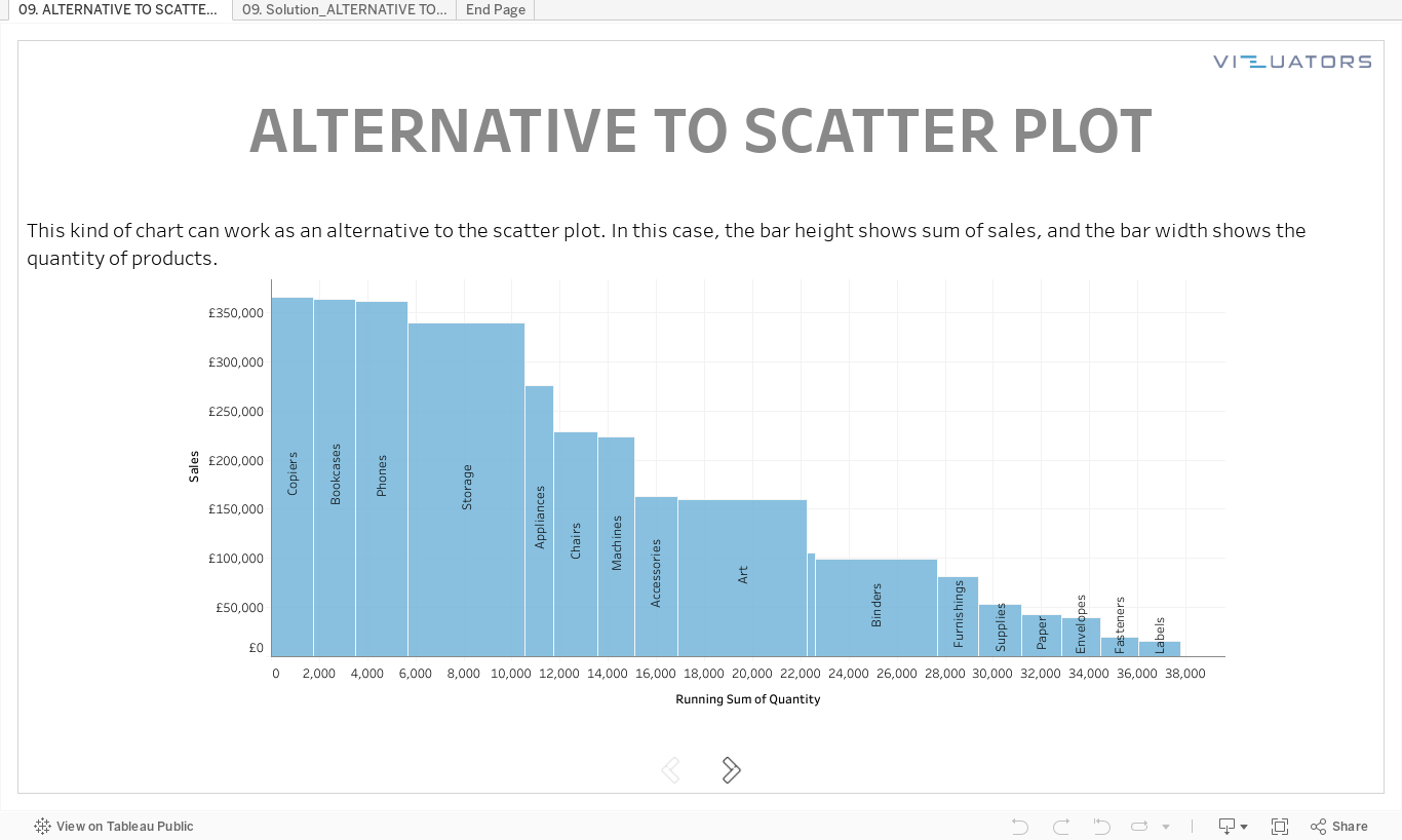
Tableau practice is the best way to develop your data visualization skills. Therefore, our team trains Tableau skills by solving additional tasks of varying complexity. Then we meet via Zoom and discuss all possible solutions.
We call it Tableau Challenges and invite you to participate!
We call it Tableau Challenges and invite you to participate!
Take your free
Tableau workbook
Leave your mail, and we will send you a workbook with the tasks and a link
to the solution registration page.
Enjoy experts' solution analysis with Vizuators team!
to the solution registration page.
Enjoy experts' solution analysis with Vizuators team!
By clicking the button, you agree to the processing of personal data. We use it to stay connected. Read more

Contact us